A few years ago, the gold standard for a product mockup was flawless: studio lighting, zero shadows, paper so crisp it looked like it had never been touched by human hands. Today, designers are doing the opposite — deliberately folding, staining, and scuffing a brochure mockup before sending it to clients. It’s not sloppiness. It’s strategy.
The Psychology of “Almost Perfect”
Run a simple A/B test: show the same tri-fold brochure in two presentations. One is shot on a seamless white background, pixel-sharp, with mathematically even shadows. The other sits on a wooden desk, slightly curled at the corner, with a faint coffee ring near the logo.
Viewers consistently read these two images differently, even though the design inside is identical:
- The glossy version signals scale, budget, and corporate polish — but also distance. It can feel like stock photography, something generated rather than made.
- The imperfect version signals that a real person handled this object. It reads as more trustworthy and more “finished” in a lived-in sense, because it shows the product functioning in the world rather than floating in a vacuum.
This isn’t a fluke of taste — it’s a known effect in design psychology sometimes called the “imperfection heuristic.” Small, plausible flaws make a staged scene feel less staged. A crumple in the corner of a page or a slightly off-kilter paper clip acts as visual proof that nobody spent three hours retouching the shot. Paradoxically, that makes the presentation feel more professional to certain audiences, not less — because professionalism, for a growing share of buyers, now means honesty about process rather than concealment of it.
The catch is context. A fintech pitch deck still wants the seamless, glossy treatment; a hospital brand guide does too. But for anything positioned around craft, ethics, or authenticity, glossy can actually work against the message. If your copy says “handmade” and your imagery says “assembled in a render farm,” the two signals contradict each other, and clients notice — even unconsciously.
Where the Trend Comes From: Craft, Sustainability, and the Backlash Against Polish
The rise of imperfect presentation tracks almost exactly with the rise of the craft and sustainable brand economy. As consumers grew skeptical of glossy advertising — and of greenwashing in particular — brands needed a visual language that couldn’t be faked with a render engine. Texture became shorthand for honesty.
A few forces are driving this:
- Sustainability marketing leans on tactile, recycled, “imperfect by nature” materials — kraft paper, uncoated stock, visible fibers — and the presentation now has to match the product.
- The maker economy (small-batch coffee roasters, independent stationers, natural cosmetics) built its identity on visible human labor, so a flawless digital render undercuts the story they’re telling.
- Social media aesthetics, especially the shift toward “unfiltered” content on platforms like Instagram and TikTok, trained audiences to distrust anything that looks too clean.
In short, naturalness has become a marketing asset in its own right — not a compromise, but a deliberate choice that signals values.
Who’s Actually Doing This
The trend isn’t theoretical.
Independent stationery studios routinely present business cards and letterpress work on raw linen or slightly worn desks rather than sterile backgrounds, because the texture is the pitch — it shows the paper stock and ink depth that define the product.
Coffee roasters and small food brands frequently shoot packaging mockups with actual coffee rings, flour dust, or wood-grain surfaces, tying the presentation directly to the product’s origin story.
Eco-conscious agencies designing recycled-paper collateral often photograph brochure mockups on textured, uneven surfaces specifically to avoid the “plastic” look that a perfectly lit studio shot can accidentally create.
Local bakeries and small-batch skincare brands often present their labels and boxes alongside raw ingredients — flour, dried herbs, unfinished wood — rather than on a clean set, because the goal is to visually anchor the product to where and how it’s actually made.
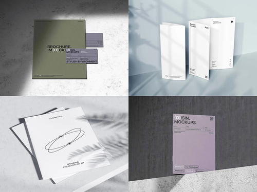
This is also why mockup libraries have expanded well beyond flat, sterile templates. Studios like ls.graphics now offer scenes with realistic shadows, paper grain, and environmental context — desks, hands, natural light — precisely because designers need that authenticity built in rather than faked in Photoshop after the fact.
Practical Takeaways for Designers
If you’re deciding how to present a piece of print collateral, a few questions help:
- Does the brand’s core message rely on trust, care, or craftsmanship? Lean imperfect.
- Is the audience corporate, investor-facing, or luxury? Lean polished.
- Are you showing a physical product whose tactile quality matters (paper weight, print texture)? A slightly imperfect setting often communicates that better than a flat render.
The smartest studios don’t pick one lane permanently — they match the mockup style to the pitch, sometimes producing both a clean hero shot and a lived-in lifestyle shot for the same deliverable.
The Real Lesson Behind the Trend
What’s happening isn’t really about coffee stains or paper clips at all. It’s about presentation catching up to a broader shift in what audiences find credible. Perfection used to signal competence; now it can just as easily signal artificiality. A well-placed crease or a faint shadow from a real desk lamp does something a perfect render can’t — it tells the viewer that a human being was in the room. In a market increasingly skeptical of anything that looks manufactured, that small, deliberate imperfection might be the most persuasive design choice on the page.